Sofa U Love

Sofa U Love is a California-based family-owned custom furniture store. They have showrooms down the coast of California, but their online presence lacks the necessary UI to stand up to competitors. As part of a student design project, I designed an update to Sofa U Love’s website to appeal to those looking for the ease that online shopping brings, while keeping that in-store experience at the forefront of the user’s experience.
Duration
Two week sprint
Platform
Desktop site
Tools
Sketch, Airtable, Google suite, Post-its
Role
UX Research
UX Design
Team
KC Morris
Deliverable
Interactive Prototype
Problem
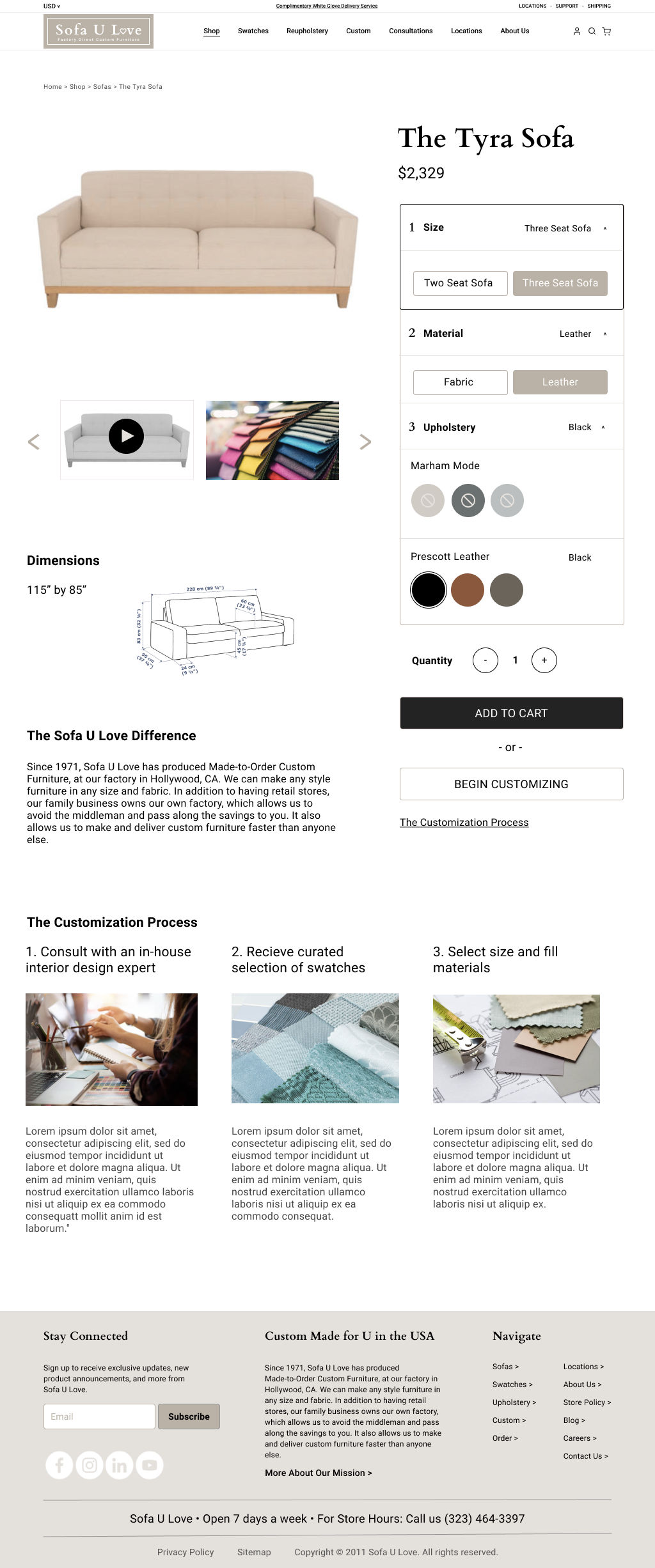
Customers feel underwhelmed about upgrading their current sofa needs to go to Sofa U Love, but they face not being able to see the quality or measurements of their sofas.
Solution
Creating a personalized and detailed product offering while staying away from being overwhelming in this presentation of information was my goal for this redesign.
Discover
Understanding the Vision
Users want to conveniently shop for a quality sofa from the convenience of their home, while feeling like they were able to have a hand in the design process.
Understanding the Users’ Behavior
After interviewing 5 people who have bought big-ticket items online before and discussing their furniture shopping preferences, I learned that people like the ease of shopping on Amazon, while still feeling like they had a hand in the design process.
Listening to Users
Users missed that in-person experience of feeling like they had a hand in the design process. It’s difficult to get a feel of a fabric without physically touching a swatch, or knowing how plush cushions are when you can’t actually sit in them. I wanted to know
Their motivations for shopping online vs in-person
If / how they decide on a big-ticket item
Learn what will make them feel comfortable when purchasing an expensive item online
Discovering Patters in our Users’ Behavior
In the feedback from my interviews, I was able to create several iterations of affinity maps to start to see patterns in shopping behaviors. The findings reenforced my initial hypothesis that people are wary of buying something so expensive online when there are so many unknowns.
Finding Inspiration in Unexpected Places
One interesting piece of feedback when I spoke to one of my candidates was that they do all of their shopping online, except for grocery shopping, because they prefer to pick out their produce themselves. While this might be something that could easily be overlooked, it was this nugget of information that caused me to dig a little deeper into what drove them to have this preference.

Ideate & Design
Developing the Persona
Alex is in his early 30’s, and is newly engaged. Because he is moving in with his fiancee, he is looking to move away from his Ikea furniture and upgrade to a more appropriate compilation of furnishing to match his mature new phase in life.

He knows he likes good quality, and even though he does prefer to shop online, his grocery shopping is done in person because he likes to handpick all of his produce himself, because he’s a stickler for small details and imperfections. Translating this to purchasing a couch, he would love to be able to thumb through fabric swatches so that he can see and feel those textiles in person, while still having the flexibility of being able to shop from the comfort of his own home, in his own time.
Ideating on Features
What needs to be included to make this Minimum Viable Product worth the client’s time?
How do we present people like Alex with that best in class customer service and feeling like he can peruse binders of swatches and know exactly what the possibilities are, all without stepping foot into one of your showrooms?
Connecting the Features Together
Creating a personalized and detailed product offering while staying away from being overwhelming in this presentation of information was our goal for our redesign.
Not having enough information is what scared Alex away in the first place, so we want to make sure the specs of his purchase are clearly spelled out on each product page so that he is aware of where exactly his money is going, and what exactly is going to show up in his living room on delivery day.

On To Design!
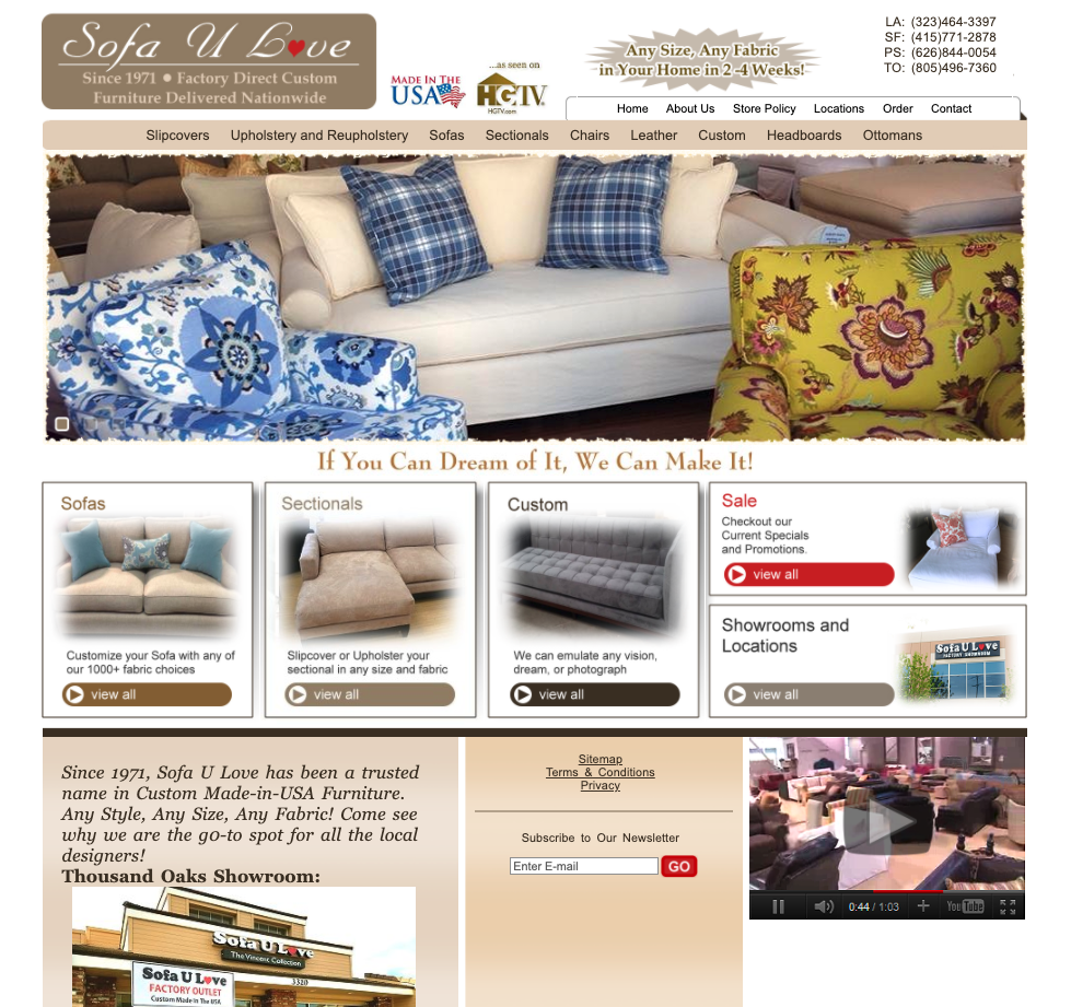
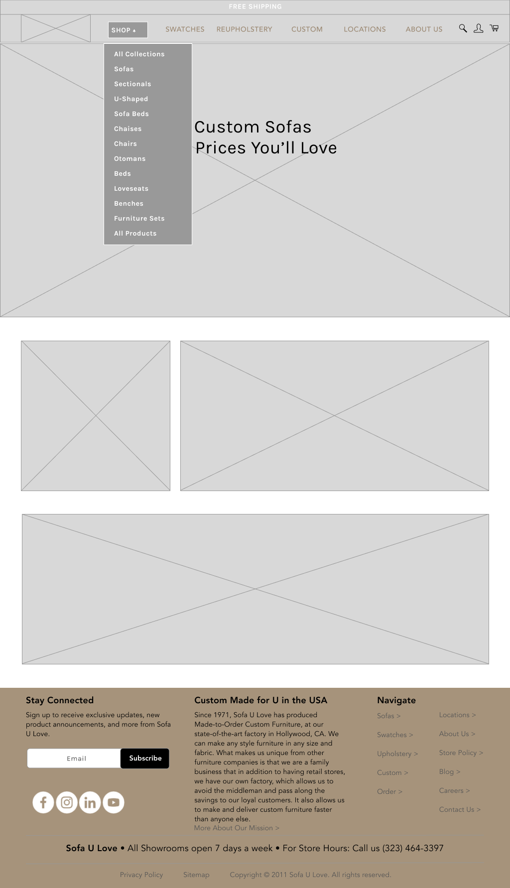
There were quite a few iterations of this site that we toiled over. Staying true to the original colors and logo was the goal, but I also felt that the logo and colors needed an update, and a little punch of modernity. So we went from this to this.

Test & Iterate
Putting the Prototype in the Users’ Hands
My medium fidelity prototypes based on user flows were shared with 5 potential customers that I was able to conduct usability tests with.
The biggest takeaways were adding more detail when it came to how they might be able to customize their sofas. Another thing I wanted to revisit was the Information Architecture of the global navigation dropdown menus.
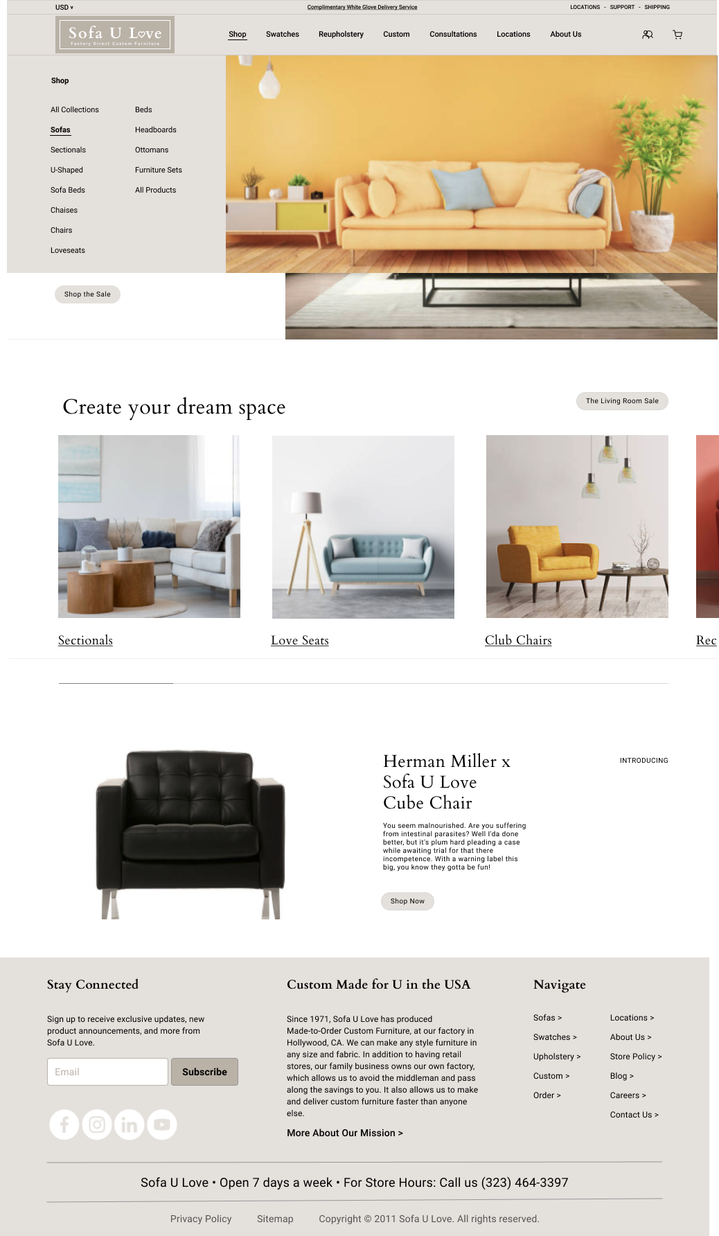
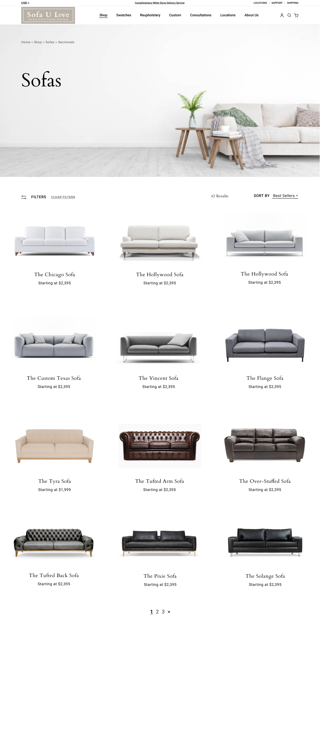
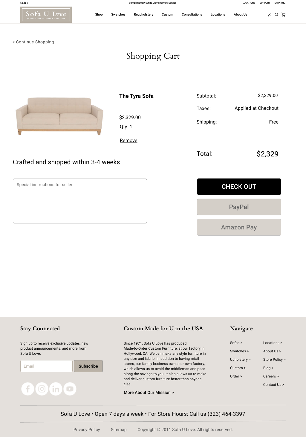
The End Result
I created high-fidelity wireframes, keeping the existing Sofa U Love’s existing style guide in mind, while bringing their aesthetic into the 2020s in terms of minimalistic design.