Lime Scooters
Lime is a micromobility electric scooter sharing company for urban communities. Riders can use the Lime app to find the Lime scooter closest to them, scan the QR code located on the scooter, and pay for their ride all within the self-contained app. As part of a student design project, we designed a rewards program for Lime to incentivize safer commuting through safer riding practices.
Duration
Two week sprint
Role
Research
Content Strategy
Visual Design
Platform
Mobile app
Product interface
Team
KC Morris
Alex Ripberger
Kyle Houston
Tools
Figma, Miro, Asana, Google Suite
Deliverable
Interactive Prototype
Problem
As many cities are complaining about the hazards that public scooters present to riders and pedestrians alike, Lime has recently announced technology to detect when users are traveling on the sidewalk. While this technology exists, not a lot is being done to keep riders from breaking the rules and riding on sidewalks, putting both themselves and pedestrians at risk.
Solution
We designed a comprehensive rewards program that encourages good scooter etiquette, rather than punishing Lime customers for breaking local traffic laws. Rather than reinvent the wheel, my team built upon Lime’s existing sidewalk detection technology to give riders “Lime Points”. Our solution aimed to teach riders safety rules through gamification, while doing away with excessive onboarding screens and pacifying potential metro legislation.
Discover
Understanding the Vision
Lime wants to set the standard for motivating good behavior. The company is looking for technology solutions that help educate and encourage their riders to have proper scooter etiquette, rather than punishing them for doing the wrong thing.
Understanding the Users’ Behavior
We designed a customer survey to quantify user behavior when using app-based electric transportation, as well as their preferences in taking public transportation (before Covid-19, of course).

Listening to Users
Since only 6 of the 12 people we surveyed had used an e-scooter before, we were able to conduct 5 user interviews to hear about:
Their motivations for using a scooter
If / how they understand the rules for safe riding
Learn what will motivate them to change, that is, if they're doing the wrong thing.
Discovering Patterns in our Users’ Behavior
Based on the feedback we received during our user interviews (and 4 iterations of our affinity map later), we were able to arrive at almost 40 ideas and concerns related to the scooter experience that helped structure our persona.
These ideas were grouped into larger categories, which fell under the tenants of:
App communication
Motivation for riding
Rider dos and don’ts
Learned etiquette
These “Core Categories” are what we took with us moving forward as the main focus of what to design around.
Finding Inspiration in Unexpected Places
Unfortunately, Lime did away with the majority of their screens featuring safety suggestions in their onboarding process in an effort to get users off and riding as quickly as possible. We were left with the conundrum of how we might introduce scooter safety and best riding practices along the way, without frontloading the onboarding experience.
So, we looked outward; mainly drawing inspiration from Uber’s user flow and the Starbucks app’s rewards program. Our challenge was marrying a streamlined transportation app with a loyalty program built on motivating gameplay.
Ideate & Design
Developing our Persona
Time to meet Lucas! Taking the patterns we discovered through synthesizing our interview materials, my team developed our target user: Lucas Smith.

Now before Lucas can ride off on a Lime into the sunset, we need to solve his problem:
Lucas needs to know the proper scooter etiquette so that he can get to work in a safe and timely manner.
Now we’re getting somewhere! Now that we know his problem, let’s start digging deeper.
How might we give Lucas a way to know the proper scooter etiquette?
How might we notify Lucas that he is breaking a rule?
How might we alert Lucas to find another path when the GPS senses that he is on a sidewalk?
Ideating on Features
“Must have”, “should have”, “could have”, “won’t have”. We debated. We wrestled. We met in the middle and landed on our minimum viable product. Always keeping our core concerns in mind, we refined our conclusions.
What would solve our problem and suit Lime’s business goals? Ultimately, we assigned an answer to what solves for both x and y: Incentivize, Notify, Empower. Each of the features that made the cut for our “MVP” needed to fall within those 3 categories.
Connecting the Features Together
So what happens when we put this all together, when Lucas begins trying to learn scooter etiquette and get to work on time?
Here you can see the specific route he took, and how the scary ending influenced his decision to no longer ride scooters, thus losing the company a potential customer, as well as an advocate for e-scooters in the city.
We designed and iterated on the rider user flow in the phone app and on the LED screen mounted on the scooter handlebars. Since rewarding specific behavior was our end goal, we created a customer journey map to see if all of the features we chose to include in our MVP solved all of our problems.
On To Design!

Paper low-fidelity sketch 2. Medium-fidelity wireframe 3. High-fidelity wireframe
Test & Iterate
Putting the Prototype in the Users’ Hands
Our medium fidelity prototypes based on user flows were shared with 4 potential customers that we were able to conduct usability tests with.
Finding
Users didn’t know what “Lock” button meant
Users didn’t know where they were on the map
Users didn’t know scrolling was necessary to advance to next screen
Language was inconsistent for Lime Points rewards (Free Ride vs $10 off your next ride)
Iteration
Reword Button to make more intuitive
Add a blue dot to the map (scooter location)
Add an arrow at bottom of scree to indicate clear Call to Action
Make sure all language and math is consistent across all screens
The End Result
We created high-fidelity wireframes, keeping the existing Lime’s existing style guide in mind so that our addition might seamlessly be incorporated into their current product.
How to Earn Lime Points
The rider is able to dive deeper into learning the ways to earn Lime Points and see the progress toward their reward.
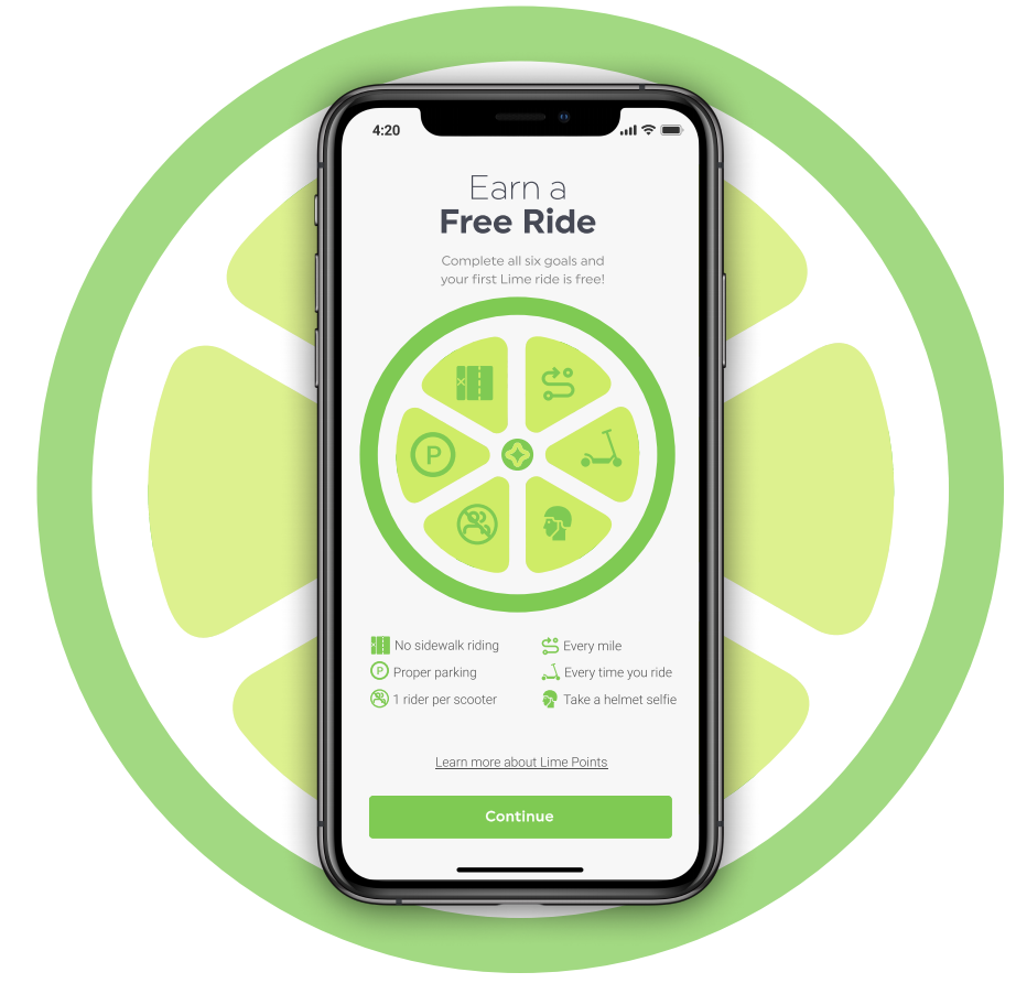
Onboarding
The onboarding introduces the rider to Lime Points, which gives them a snapshot overview of what the program is, while suggesting proper scooter etiquette.


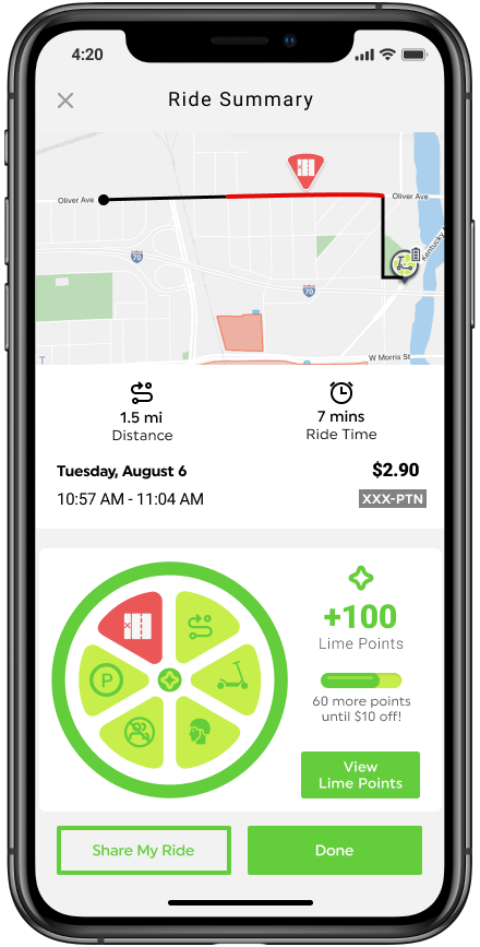
Ride Summary
After the rider ends their trip, they can see the distance travelled, the final price, the Lime Points they earned, as well as the areas where rules where broken. Rather than punishing riders, showing them the parts of their trip where they rode on the sidewalk gives them an opportunity to see how how they might improve on their next ride.
Ride in Progress
While the Ride in Progress screen wasn’t part of the solution we were solving for, we found that riders were confused by the phrasing during our usability tests. The “Stop Scooter to Access” area was a button simply titled “Lock”, which wasn’t intuitive for users, so we changed the language and information visible.

Sidewalk Detected
This screen appears on the LED screen built into the scooter’s handlebars when the scooter detects sidewalk riding. It was designed to be read quickly and clearly.
